The Princess Cafe Redesign.
The Princess Café is a unique small, local business, with a distinct energy, appeal and following within Waterloo. Its site, however, does not do the business justice – either in the way it reflects the cafe, or in how it is set up to help draw new customers and business to the café.
The café’s eclectic style, mixed furnishings, mugs and chalkboard menus provide a great starting point for the site’s visual style. But underneath the casual tone of the café lies a distinct purpose and attitude of the owners. The café is meant to be a community hub, in the original sense of the coffee house of the 17th and 18th century: places of learning and discourse. It’s also meant to be a place to get some great, fresh food. Because of these layers of context: the place, the food, the different menus, the catering options and the entertainment events, the site needs to promote a variety of related topics.

The Original Design.

The role of the website should be to draw new customers to The Princess Cafe. To do this, it should reflect the experience of the cafe to some extent, to give potential customers a good impression of what to expect. This website, however, is bare and lackluster. It provides some very basic information, but it does not provide any sense of the experience at the cafe. In addition to this lack of experience content, the site is cumbersome for the limited content that it does contain, with many different pages displaying the same information, or none at all.
Home page
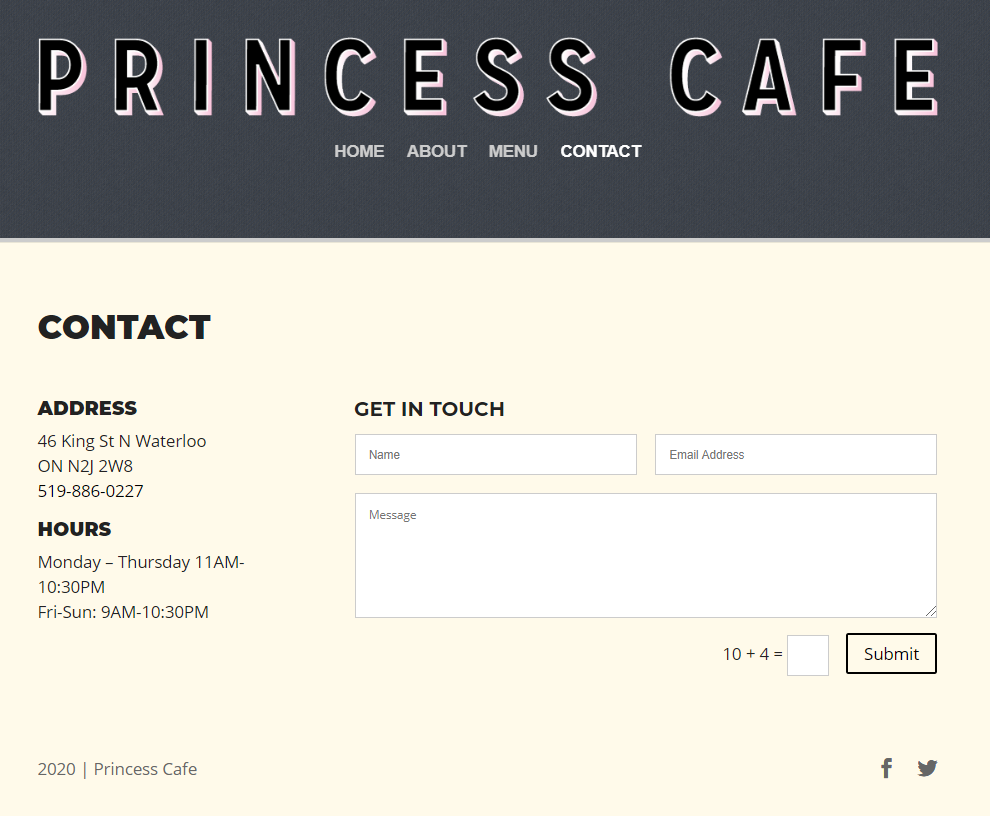
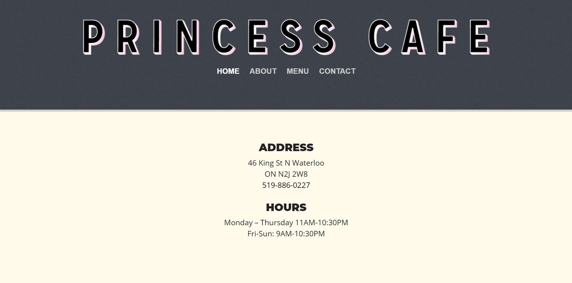
The home page only contains the business address and hours of operation. The majority of visual impact is from the very large page-wide logo and the menu. It lacks any photography to give the viewer a look at the cafe, it’s food or the type of community events that it hosts.
Navigation
Upon landing on the Princess Cafe website, the viewer is drawn to the dark navigation menu bar instead of the page’s main content. There are six items to choose from in the navigation, however, the amount of actual content on this site doesn’t justify the number of pages and drop downs. The viewer has to go through too many clicks to get limited or poor information. On the plus side, the navigation text is limited to a single, intuitive word for each section. “Cheeses Murphy” is a link provided in the global navigation. A logo included with the text implies that there is some special content here. The link, however, brings up the Cheeses Murphy website, which is blank.
Content
As outlined above, the Princess Cafe website is broken into many different pages. Overall, each page and the site itself has relatively little content. There’s an impression that the overall site structure was developed with great intentions, but content upkeep was abandoned (likely in favour of social media sites, which appear to have updated content).
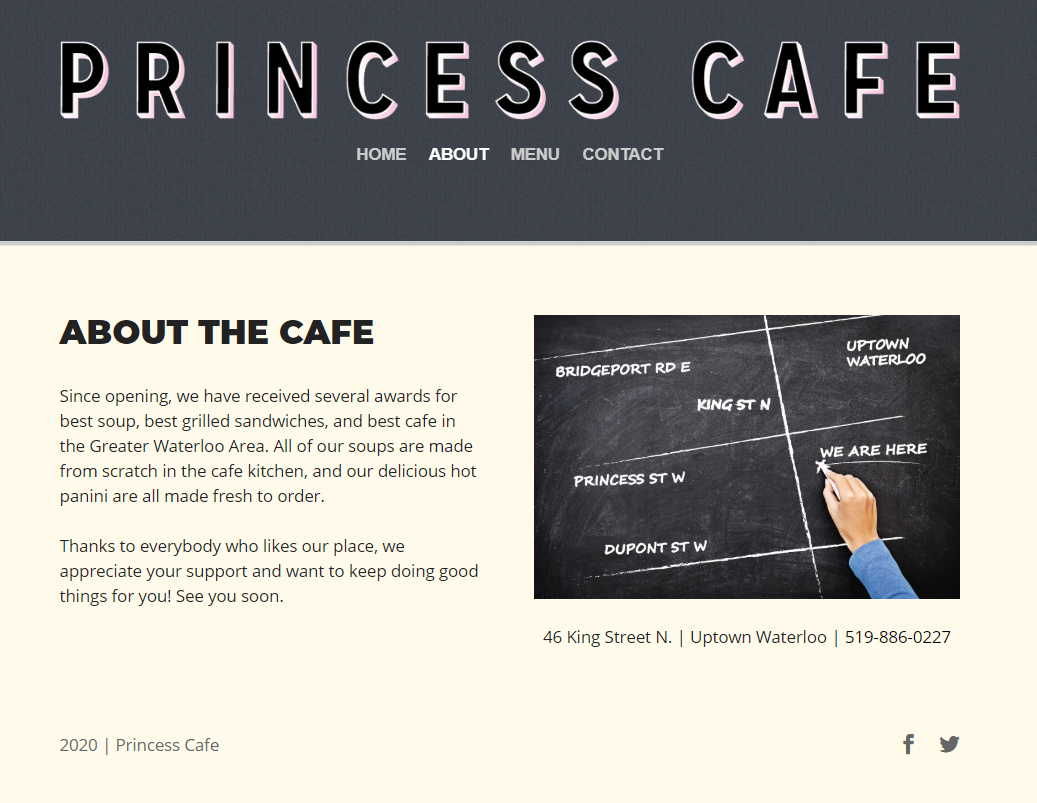
Location is repeated three times on the site (including the home page). The “about” page is made up of four sentences, the address and a map. This information should have been contained on the home page. There’s no value in having to search for it. The contact page is the third place where location information appears. It also includes a contact form. Our request for information sent via this form was not answered, indicating that there may be no one monitoring it.
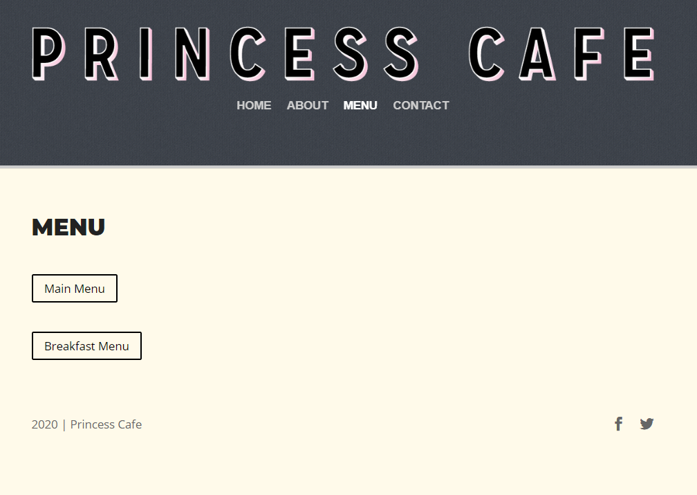
Menus are presented as PDFs. While this may be efficient in terms of reusing the menu art from the cafe, the menus themselves are not visually ideal for web viewing. Each PDF is accessed through a separate page from the menu. This, again, is not necessary. These could easily have all been provided as links from the same page, saving the site visitor time and clicks. The fact that this cafe caters is hidden in the drill-down menu. This is not even mentioned on the “about” page, which is a key lost opportunity.
Events are an important aspect of The Princess Cafe. However, the site states that there are no upcoming events since 2017. Their facebook page shows this is not the case. The site is giving the impression that these events no longer happen, misinforming site visitors.
Visual content on the site is limited to graphic-rich posters from past events. This glaring lack of visuals of the cafe, the food it serves and the ambience, community events and general vibrancy of the place is a huge flaw of the site. For a place- and food-based business, the site does nothing to present these aspects. With no images to speak of, only colour, graphic elements and font remain to carry some of the brand/experience cues. The shades of grey and beige that make up the site palette similarly are uninspiring and lacklustre.
Visually, graphically and structurally, this site is not doing anything to promote the vibrant business that The Princess Cafe is to those who have never visited it. Rather, it is sending negative messages.

The Site Redesign.
The Site Analysis.
Who the visitors are:
Based on our research we found that there are two distinct markets that the cafe attracts. If you visit the inside of the cafe you will find a sign on each table indicating they are laptop-free zones after 5pm. This allows the cafe to be a popular study spot for students in the day-time between opening - 5pm and popular for adults and seniors who like to visit for dinner. A third audience that the cafe is also catering to is people looking to have an event catered. The website should have usability and easy navigation that appeals to all of these audiences.
Why people visit:
The purpose of this websites is for first time visitors to the cafe along with those looking for catering services from the cafe. For the first time visitors, they may be comparing the princess cafe to the many other coffee shops down king street. For the student audience, they are most likely looking at the hours of operation, available seating area and food/drink menu. For the older audience, they are looking specifically for the menu and hours (again in comparison of the many other restaurants and coffee shops on king). Finally, those who are looking for their event to be catered, they are probably looking for menu options that the website is offering. As an additional added value, the cafe also hosts comedy events that not many of its visitors know about (largely due to the in-accessibility of this information). These events could attract more visitors of all target ages.
What visitors are trying to achieve:
Once the visitors arrived on the site, depending on the audience, they will be looking for different sets of information. Students will be trying to achieve an understanding of the cafe’s aesthetic, menu or information about when they can visit. The adult audience will also be trying to achieve an understanding of the menu and atmosphere for the dinner hours of operation. For those looking to have an event catered, they will be looking for a menu, pricing and how to book the cafe to cater their event.
Information the visitors need:
When the visitors arrive at the web page, they need to be able to quickly navigate to the information they are looking for amongst all of the information needed by these different target audiences. For example, students will leave the website if all they see is the catering menu. This would cause the viewer to think that what they are looking
The Sitemap.


After going through many different iterations for a possible sitemap redesign, it was decided to go with the one presented on the right.
The site redesign is based on structuring the site into 3 key sections: Café, Catering and Events. The home page contains a summary and links to all 3 sections. In addition, an ever-present footer contains all contact information, ensuring that a site visitor has all information quickly at hand no matter which section of the site they are in.

The Home Page.

Knowing that today’s site visitors are very comfortable with scrolling and prefer to quickly see what’s available, the design approach is to provide a summary of the entire site’s content and structure on the home page. Overall, the site is kept very simple, with drill-down pages for distinct and separate categories of information: the café itself along with the menus of what’s available; the catering options, and; the events. To help people ultimately connect with the café, each page includes contact information, along with the map. This way, the site visitor can follow the path they are interested rapidly.
Within each section, relevant information is simply organized. Contextual, in-line links are provided within the copy where natural connections are made to the café’s other offerings. Much information is also found in the Princess Café social media channels. These are highlighted and utilized – particularly for event notifications.
Through the redesign process, our team wanted to ensure that the information about the physical location of the Café was ever present to help drive users to becoming customers. We included the Café’s hours, address, contact information (phone number and email), location on a Google map, links to the other pages and social media accounts. Although this is a lot of information, we kept the footer de-cluttered by dividing the text and map into separate columns along with the links in rows below.
Cafe and Catering Pages.


These sections form the core of the Princess Café’s food offerings and how they are available. The Café section displays the main offerings of Drinks, Breakfast and Lunch/Dinner using a tab interface to allow users to easily toggle between them. It also includes information about the philosophy behind the Café. The Catering section uses collapsibles to allow users to quickly hone in on the category they are interested in, and then expand to view all of the available options. The updated design includes numerous pictures of both dishes and drinks that the Café offers its clientele. While some items are featured on the homepage, we also were looking to display a picture of each menu item (when selected by the user) on the menu page as part of our plan for the website’s future evolution. By including these images, newcomers will see exactly what the Café has available as menu options. With our increasingly visually based society, this will help the customer imagine themselves in the Café before even visiting and create a stronger connection to the Princess Café over others in the area.
Events Page.
Events are an important part of the Princess Café experience and we wanted to ensure that potential customers could readily get a sense of these fun and unique experiences. To showcase the Princess Café’s special events, we leveraged the visually interesting posters that the Café had created and posted on their Facebook page, and displayed these in a grid view on the new events page. The tile wall texture reappears here as a background, giving a playful impression of the posters appearing to be hanging on a wall.


The Redesign Code.
The code for the redesigned website was all done by hand without using a website builder. The HTML and CSS is available for viewing upon request.